PROJECT BACKGROUND
Mońki is an established cheese brand. It originates from a small town of the same name, hidden in rural parts of Podlasie in eastern Poland. The owner of the Mońki brand works with local suppliers who deliver only first-grade ingredients to make top-quality cheese. What makes it outstanding is the unique combination of rustic character with state-of-art production standards.

DESIGN CHALLENGE
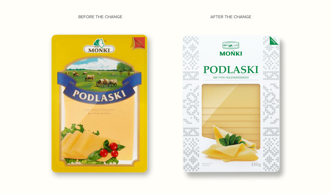
Even though Mońki had been on the market for many decades and had established quite a strong position, the brand owners knew that their product did not appeal to young, trend-oriented customers. Mońki needed to undergo a visual rebranding and thorough packaging redesign.
It was crucial to keep the traditional values embedded in the brand. What it needed was a sleek, elegant design that would express the top quality of the product in a contemporary fashion. The revamped packaging line and the entire visual identity met with an enthusiastic reception from the clients who already knew Mońki cheese. It was also hailed by those who finally noticed Mońki cheese on the store shelf.
THE SCOPE OF DESIGN SERVICE
Strategy / concept development / logo redesign / logo illustration / custom lettering / packaging redesign / pre-press / print supervision / product images (photo compositing) / packaging visualizations (3D modeling, rendering, post-production)
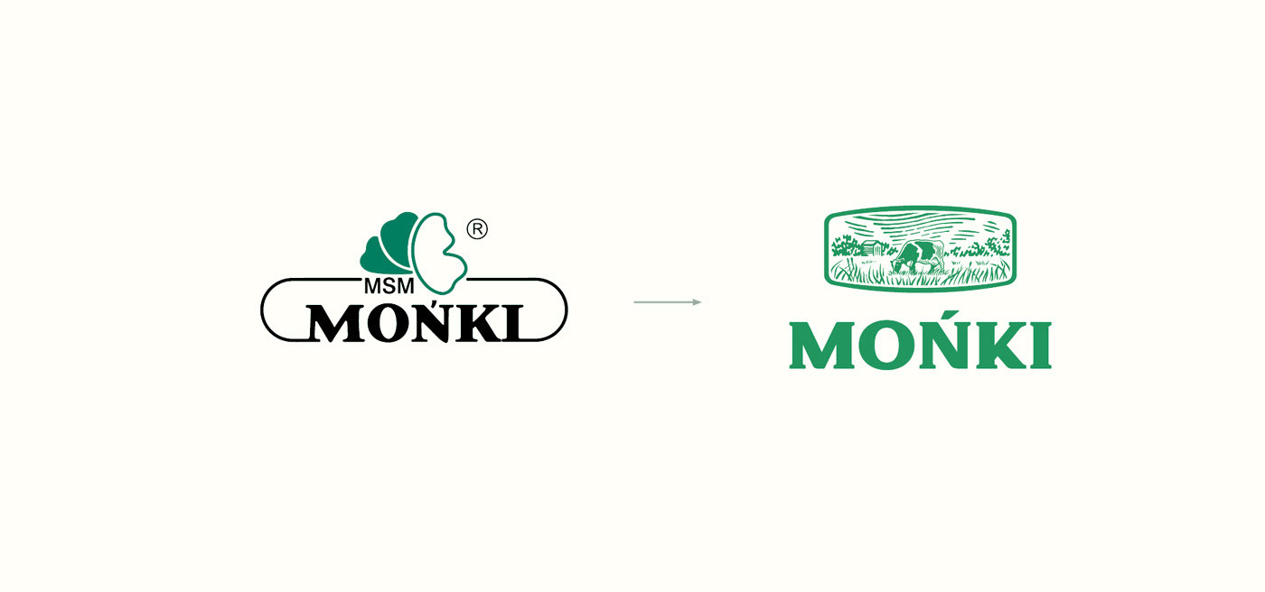
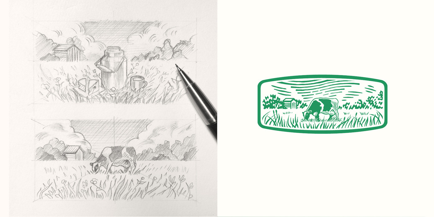
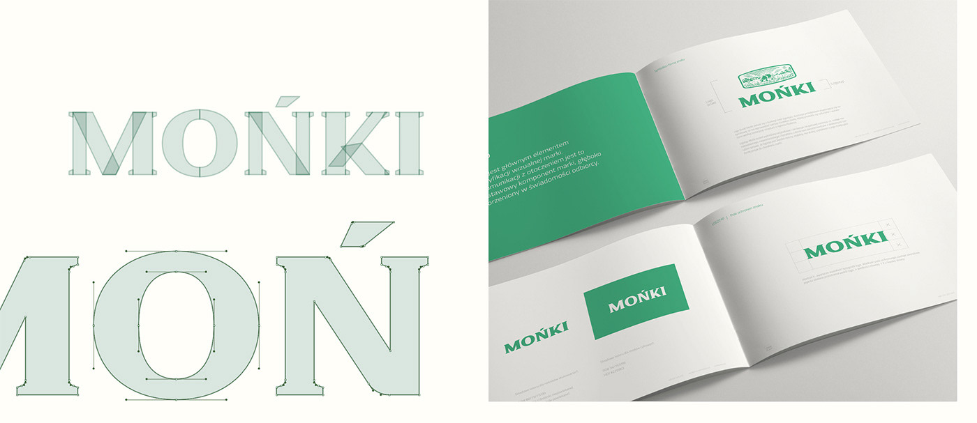
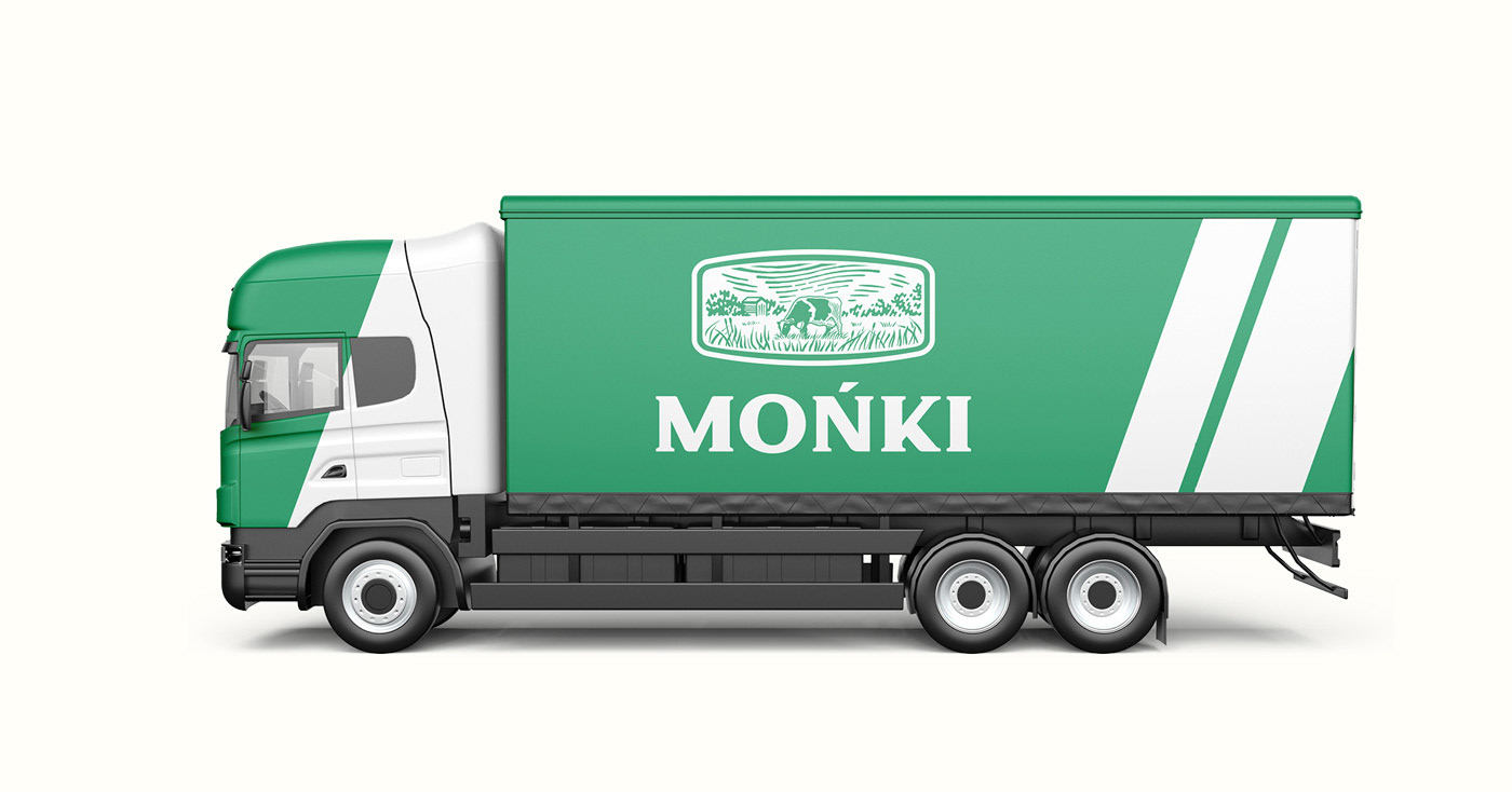
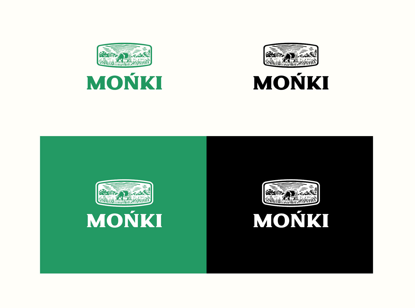
LOGO REDESIGN & VISUAL BRANDING
PRODUCT DEMO (IMAGE COMPOSITES)

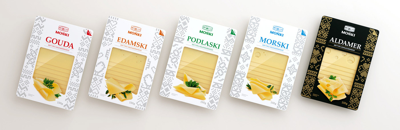
VISUAL REFERENCES (RUSTIC MOTIFS)
The visual motif utilized in the packaging design is quite common in Podlasie. It derives directly from the rustic style of cross-stitch embroidery. These embroidered patterns reflect a potent affection and attachment to nature. They also serve as “written” testimony. Those who know the code can read the meaning hidden behind these geometric symbols. For example, a star symbolizes the birth of a child. The other figures around it may inform about such details as the birth date or the name initials of a newborn.
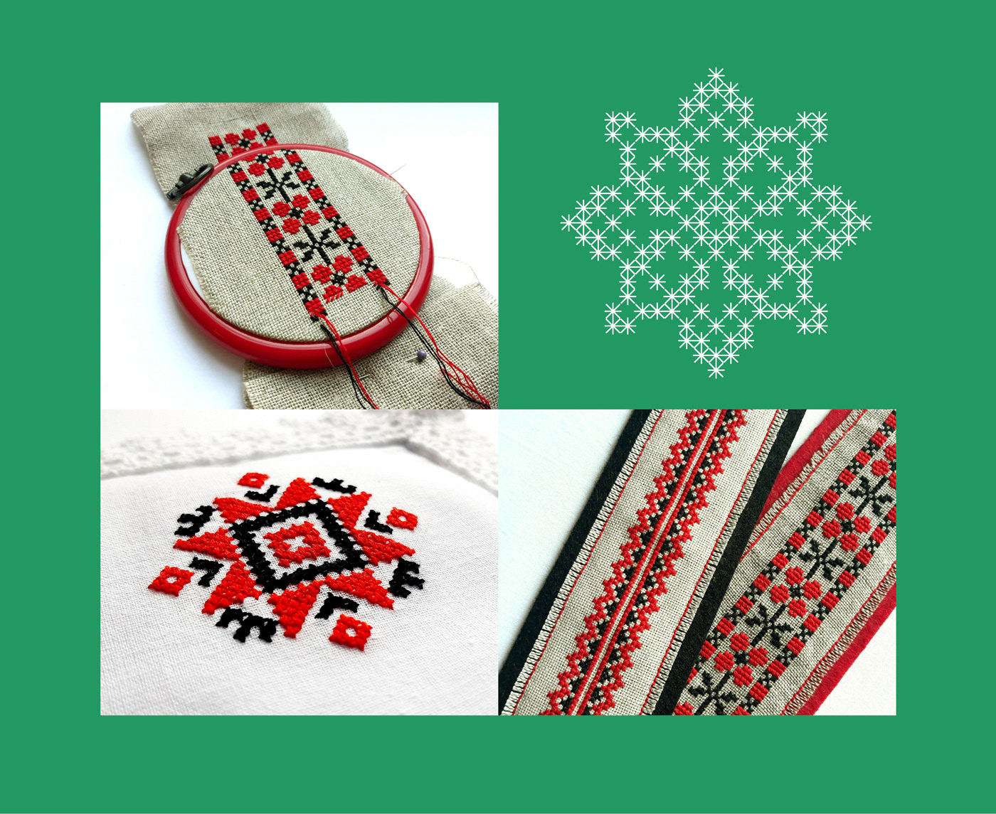
Photo courtesy of Agnieszka Jakubicz (@zafolkowana) facebook.com/zafolkowana
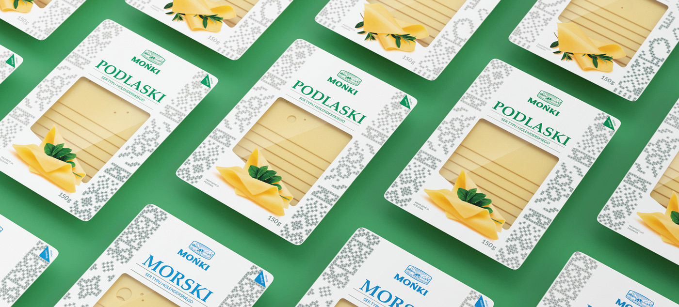
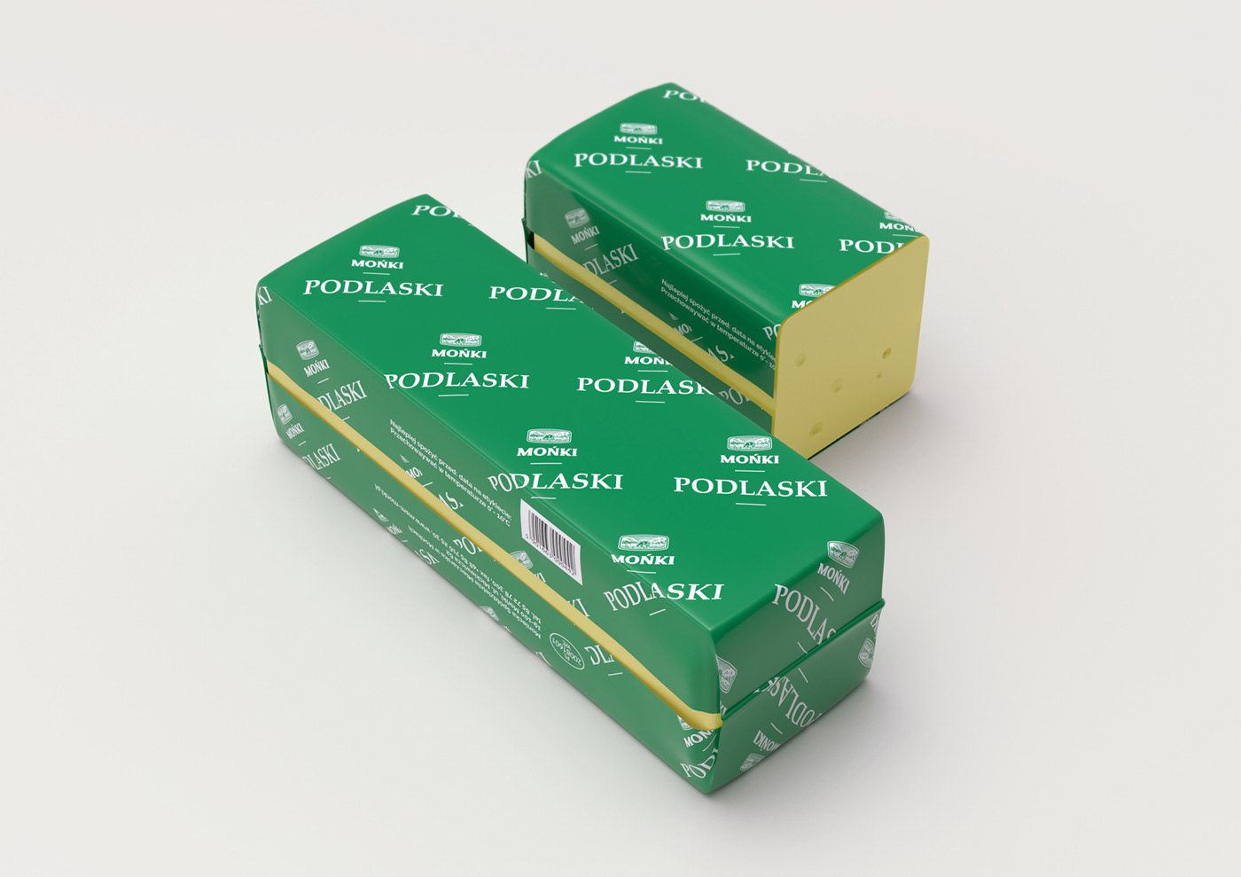
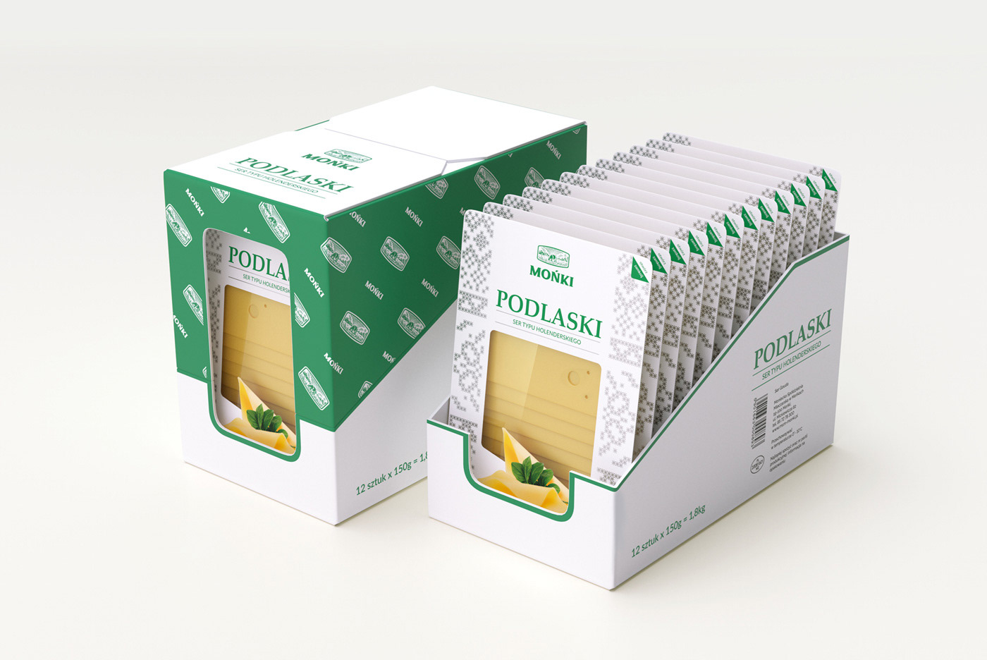
PACKAGING DESIGN & VISUALIZATION
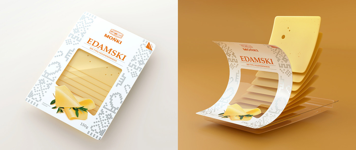
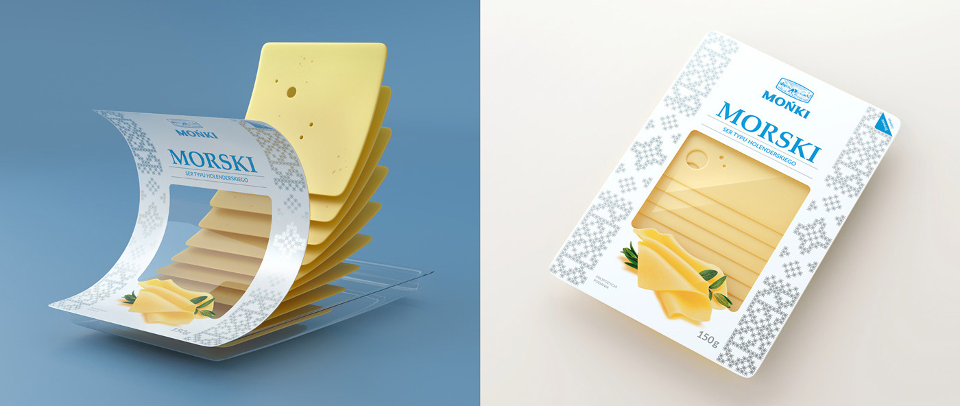
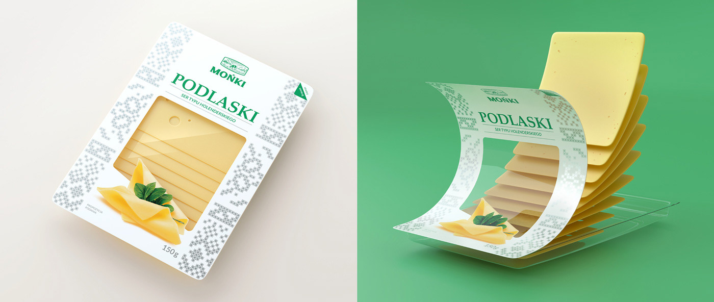
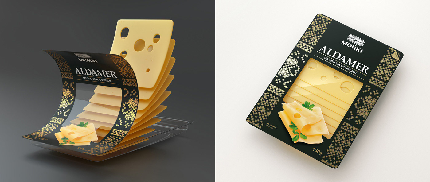
FINAL RESULT OF REBRANDING & PACKAGING REDESIGN
CREDITS
Client: MSM Mońki / Project owner: Commplace / Client service: Commplace / Project management: Commplace + brantt_ / Strategy: Commplace / Creative direction: brantt_ / Art Direction: Marek Jagusiak / Identity design: Marek Jagusiak / Graphic design: Marek Jagusiak / Visualizations: Marek Jagusiak / Implementation: Marek Jagusiak
Need a DESIGN like this one?